 Week 196 was posted by Charanjit Chana on 2021-07-26.
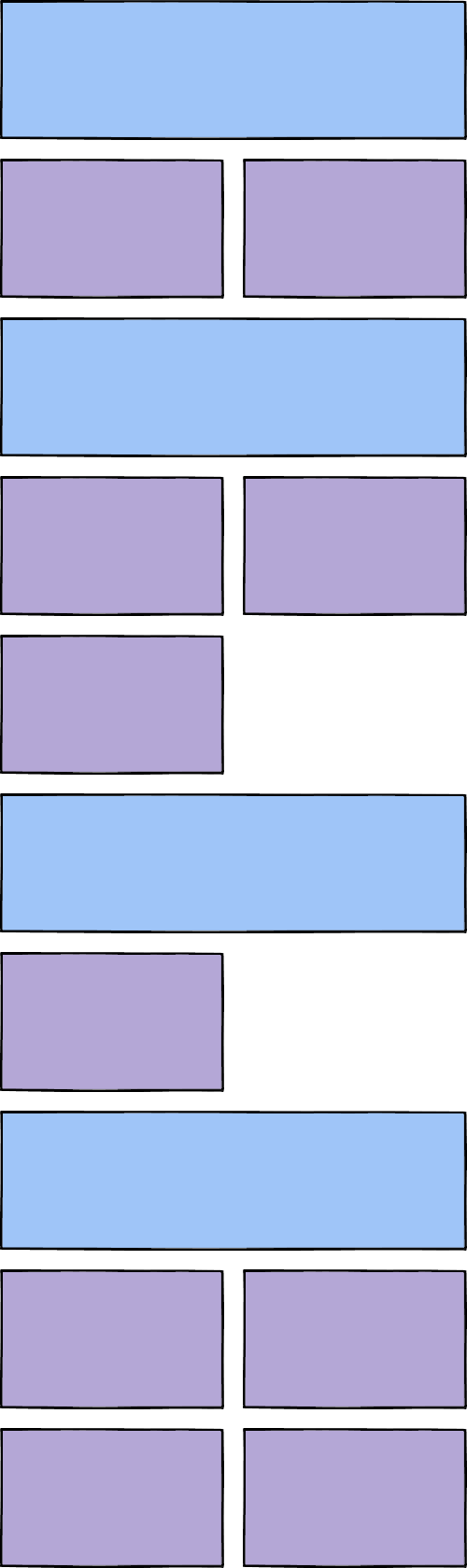
A few weeks ago I came up with an idea on a listing layout I'd like to use in the future. I've put in a mockup of how I wanted it to work below, nothing too complex but it felt like something that was perfect for CSS grid only I couldn't quite work out the correct way to cook up the right mix of N-match notation to get the layout to work.
How I got it wrong
Everything I tried worked for the first two larger blocks and their smaller siblings. Once I got to the third it fell down because it was inheriting styles from the previous blocks thanks to selectors like .major + li:nth-child(even), .major + li:nth-child(odd) to match them no matter where they came in the order.
The only way to explain the issue was that I was just trying to be too clever with N-match notation. In fact, you don't even need it for this situation. For some reason, I assumed CSS Grid would honour the column that would have come naturally. CSS Grid is far cleverer than that and actually collapses in exactly the way I was trying to solve with N-match notation.
The solution with CSS Grid
After declaring my grid against the ul, this is the code required to create the larger blocks while the CSS engine just figures out the rest:
li {
  padding: 10px;
  &.major {
    border: 1px solid red;
    grid-column: 1 / 3;
  }
}
That's really all I had to do. Let the browser figure out the order in CSS Grid and focus on the elements that need to be different.
I really should have started with the basics, but it wasn't obvious to me when I first tried. Here's the working layout on Codepen:
Tags: css, development, web