![]() Week 402 was posted by Charanjit Chana on 2025-07-07.
Week 402 was posted by Charanjit Chana on 2025-07-07.
I am in the process of building a new app, it is written in SwiftUI, and I'm hoping to support both iOS 18 and the forthcoming iOS 26.
Liquid Glass brings some interesting layout choices. I'm not mad at the tab bar, which now hovers above the content, but it feels unnecessarily large. Maybe this will change by the time we get to September though.
What I've found most frustrating is working with button styles. Using the tint() method will change the foreground colour, which is perfectly fine but when you combine that with the .borderedProminent style you don't just get a tinted button but a tinted button with a 'traditional' iOS bordered button sitting within it.
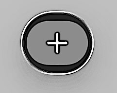
It's actually not that noticeable in the Xcode preview because it's so small but it's clearly an issue in the simulators.
So I'm still grappling with it all, but for the most part the modifiers I'm applying are backwards compatible so the app will look fresher with the OS updates in September.
David Smith has been posting about design choices as he looks to adopt Liquid Glass in his own apps which are well worth a read.
Tags: