![]() Week 291 was posted by Charanjit Chana on 2023-05-22.
Week 291 was posted by Charanjit Chana on 2023-05-22.
The World Cup is one of those things that I really, really, look forward to. Lots of football compacted into a short time frame and the world's best players competing against each other. There's not really much more a football fan could ask for.
Qatar (2022) and Russia (2018) were odd tournaments, shrouded in controversy but the football was still of a great standard. As a football fan, I don't think it was particularly easy to boycott either as someone watching from home.
I have no recollection of Italia '90 and only had a vague interest around the time of USA '94. France '98 was the first World Cup for me. The logo wasn't particularly inspiring but the on-screen graphics were pretty good from what I remember.
Overall, the branding around tournaments has been pretty stale since the 1970s and followed one of two formulas: A literal football or a simplified World Cup trophy.
| Year | Location | Logo element |
|---|---|---|
| 1970 | Mexico | Football |
| 1974 | West Germany | Abstract |
| 1978 | Argentina | Football |
| 1982 | Spain | Football |
| 1986 | Mexico | Football |
| 1990 | Italy | Football |
| 1994 | USA | Football |
| 1998 | France | Football |
| 2002 | Korea & Japan | World Cup Trophy |
| 2006 | Germany | World Cup Trophy |
| 2010 | South Africa | Abstract |
| 2014 | Brazil | World Cup Trophy |
| 2018 | Russia | World Cup Trophy |
| 2022 | Qatar | World Cup Trophy |
That's 4 World Cup trophy logos in a row, preceded by 7 football based logos and only 2 abstract ones. It was all just so much more interesting before the 1970s!
My particular favuorite poster, of which I had a t-shirt at some point in time, was for the 1950 World Cup in Brazil.
And World Cup 2026?
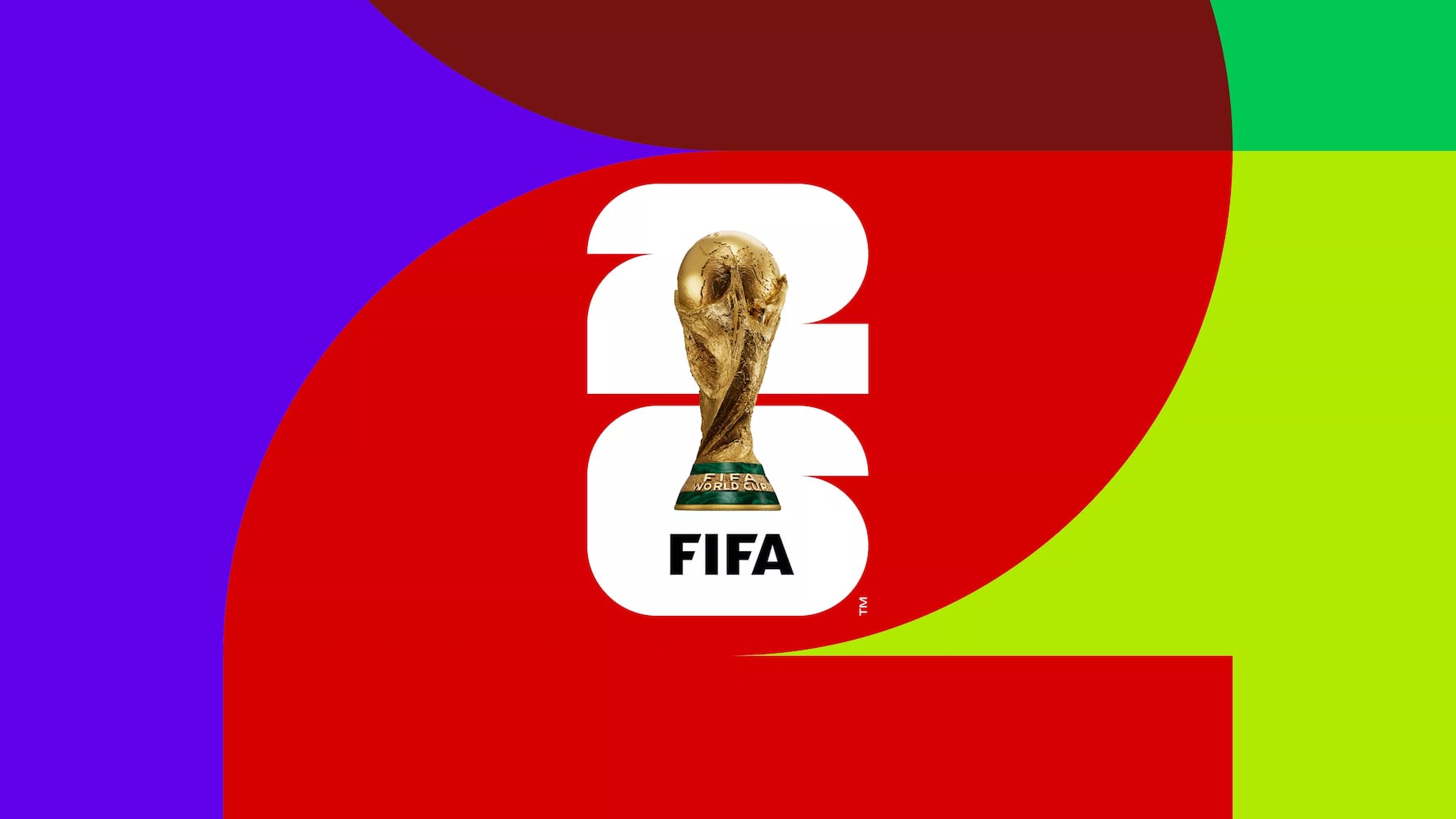
Well, not much has changed. The World Cup trophy itself plays a prominent part, but not as an abstract element or stylised illustration. The actual World Cup trophy sits on top of the number 26 as the logo.

Canada, Mexico and the United States are hosting together and the logo is bold and versatile. There's a nice bit during the brand launch video where Ronaldo is part of the unveiling, placing the trophy at the centre of the logo.
I'm looking forward to seeing more from this branding. Apart from the font, Brazil 2014 all looked pretty good to me, Russia and Qatar were not great (but maybe fit cultures appropriately), but this looks like it could go anywhere and fit really well. Totally here for it!
I'd love to embed one video here, but FIFA are blocking videos from being embedded so you'll have to head over to YouTube to watch their 'This is FIFA World Cup 26' intro video.
What will the World Cup 2026 mascot(s) be?
It will be interesting to see what mascot they pull together to fit in with this brand, I only found out that Qatar even had a mascot on the very last day of the tournament and couldn't tell you of the top of my head what any mascot was since 1998... (it was a blue cockeral and OK, nowyou're probably wondering what they've been in recent years!)
- Japan & Korea: 3 CGI creatures
- Germany: Lion
- South Africa: Leopard
- Brazil: Armadillo
- Russia: Wolf
- Qatar: Ghutrah
- Canada, Mexico & USA: TBC
Brand identity and guidelines
This is one thing I'll be looking out for, the branding on the official World Cup website makes a lot of use of masking and typography. Quite like how it's done and I'd assume it's a custom font that's being used.
The idents, stings and transitions all bring their own look and feel that really make it a World Cup. The Champions League in comparison sticks with solid branding for years, it's the international tournaments that really get to flex their muscles and it's all felt a little too tame for too long now.
I'll take this opportunity to remind myself that I shouldn't get too excited as there are still more than three years to go.
Tags: branding, fifa, football, world cup