![]() Week 36 was posted by Charanjit Chana on 2018-07-02.
Week 36 was posted by Charanjit Chana on 2018-07-02.
And now for the something completely different.
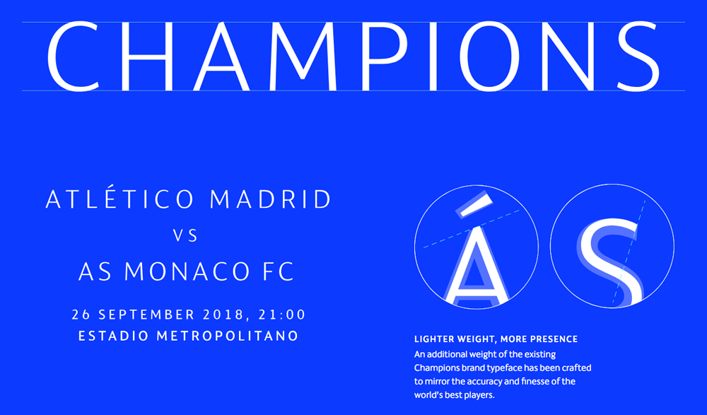
Two of my big loves are football and design and UEFA recently combined both to present their updated identity for the Champions League. Bought to my attention by Under Consideration's Brand New section. UEFA even had their own one page website dedicated to the launch of their 2018-21 branding.
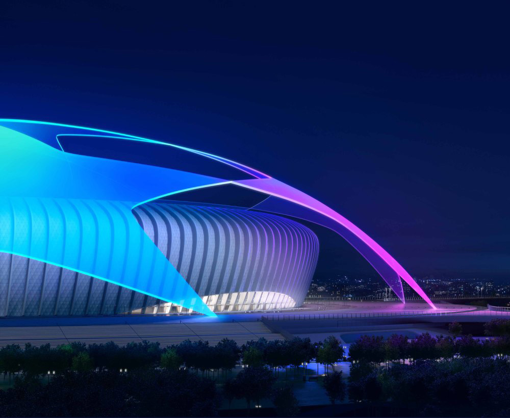
The updated identity will be applied from the 2018-19 season and is planned to live on until at least the 2020-21 season. I really like the neon feel to some of it and how they've made it work for idents and highlights.
Colours
While the dark blue remains, the introduction of pinks and brighter blues are really nice touches. The way stars are formed and the way graphics for video content are applied is really impressive.

Fonts
Fonts were also given a bit of TLC and are lighter in weight than before. Not sure about their example 'CHAMPIONS' text as it doesn't have the weight behind it but maybe in real world use it will work well. Certainly not the same weight as used in the official logo but that looks a little dated and really heavy in comparison.
Idents & Application
You can see the idents and potential applications for the new starball over on the Brand New article (linked below) but the following videos highlight what I think is an effect shape and use of colours and animation. Edin Dzeko smashing a goal in against Chelsea for Roma with the new ident looks fantastic.
While the slow moving 'starball' is one of my favourite pieces of media from the new branding, watching this finish from Dzeko against Chelsea with the new branding is pretty awesome:
Having visited Wembley a number of times, I've never seen it look as good as this:

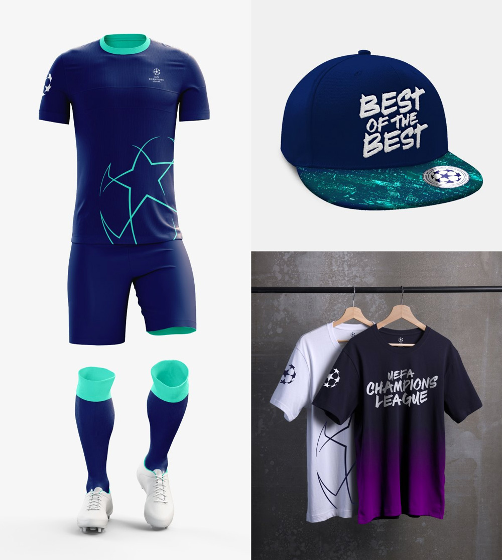
Apparel
Brand New highlighted some of the apparel and for clubs that have their kits manufactured by Adidas, the potential for a training kit that looks like the one below... I know I'd want to snap one up. As for the graffiti style font, it reminds me of the artist Futura so I'm sold on that too but not sure a t-shirt promoting the competition rather than a team would be what fans would be after.
Overview & Thoughts
I love it. I really think it's a great update to a brand that didn't really feel like it needed one. In the Europe at least, the Champions League is where it's at and the branding behind it is secondary to the matches it can throw up. This really is a good improvement.
There's a lot of information about the applications and process over on the website of the company that put it together, DesignStudio.
The only thing I'm not sure about is the intro video I've included at the top. The content is brilliant (two Liverpool F.C. players featured) but what looks like the UEFA font for captions instead of the new Champions League font seems like a bit of a missed opportunity. I know it's UEFA introducing the new branding but what better way to introduce than to use it?! Despite that tiny bit of criticism, I'm really looking forward to seeing the new look and feel next season.
What are your thoughts on the evolution of the Champions League brand and identity? Let us know on twitter.
Tags: branding, Champions League, football, soccer, uefa, branding, Champions League, football, soccer, uefa