![]() Week 74 was posted by Charanjit Chana on 2019-03-25.
Week 74 was posted by Charanjit Chana on 2019-03-25.
Arriving at 1 Thing A Week
1 Thing A Week was born after I almost admitted defeat in my attempts at blogging. Once I'd had the idea I decided I to use the project as a chance to also brush up on both my design and development skills. It's given me a format and an outlet with which to share things regularly which has been an interesting challenge within itself. Sharing items regularly is something I had just failed at miserably over the years. I can clearly recall 5 separate attempts that had varying degrees of success but not a single one exists today:.
- Billionaire-Boys-Club.co.uk which later became Be Unequaled
- Once Be Unequaled had fizzled out, I tried a magazine type format with contributions from friends but it suffered the same fate. It was partially migrated over to my personal domain but again it didn't really go anywhere
- Maloha felt like my last throw of the dice and while it worked really well for a while I just couldn't get along with Wordpress and I was too ambitious trying to update it daily
Each was very different but the Maloha 'magazine' was closest to what I'd always wanted to try and achieve over the years. It had a 'brand', it was easy enough to update and looked pretty good. It's just that it used tools I wasn't entirely comfortable with and demanded too much attention to keep the content fresh. It quickly looked stale if I didn't update it often enough and it soon languished. The magazine format began to take up more time than I'd expected and that was ultimately it's downfall. Looking back, there was no real goal behind it other than to share as much interesting content as possible. Not a particularly admirable goal and one that is already amply served. I was just aggregating content rather than focusing on the quality of it.
My Goals for 1 Thing A Week
To deliver a piece of long-ish form content once every week, make it fast and make it responsive (mobile friendly).
Weekly content has turned out not to be much of a problem, but the 'voice' is constantly evolving. I have much to work on and shorter articles can feel like I've sometimes dropped the ball. But if I look back through the archive, every week has been something I've wanted to share. I have a list of article ideas I'm going through but they often get bumped for something that should be talked about as close to the moment as possible.
Making websites fast has always been my philosophy and I've made it a priority here. I'll talk more about the design later but I wanted to build something that could looked special and fast. Making it responsive has been a in factor in making it fast because I want it to load quickly on poor mobile connections as well as on a modern desktop browser. It wasn't until late 2014 that real principle behind mobile-first design really hit me. I've known how it works for years but had just approached it the wrong way. This was the first chance I'd really had to put my knowledge into practice and it's worked out very well. I'll look at covering the technical and architectural details at a later date.
A fourth goal would be taking your privacy seriously. I'm not quite where I want to be yet on that though. Almost, just not quite. SEO was another, the site is built to be as light as possible and my philosophy has always been that 'content is king'. I could look at gaming the system but that's something I'm looking to avoid. Views for the sake of views isn't what I'm trying to achieve here..
I'll leave it there for that topic for now, but I'm always happy to discuss my philosophy and goals for this website.
Design
I've had the pleasure of working with some fantastic designers in my development career but wanted to see if I could put my head down and really build something I'd be proud of. I ended up reading a ton of information about various aspects of websites like layouts and colour schemes which was a real eye opener. The whole re-design took longer than I expected because I kept finding more resources to reference. In the end, I pushed it out and have continued to iterate on pieces of it as I've had time. Here's some more detail on the various bits of design I've looked at:
Logo
The design aspect of 1 Thing A Week was an important starting point. I began experimenting with vector based design software came up with a few different logos before settling on this one:
It looked amateurish quickly and I moved onto something a little more professional looking. That allowed me to move on to other things that needed to be done. It actually turned out to be fairly versatile in both long and short form and it's what was used everywhere until the refresh rolled out in February.
Layout
I'd long had a desire to run a content based website with big bold images that spanned almost the entire page with very obvious next and previous buttons. In reality in meant hosting and serving large images which went against my desire to have a fast website. I reined it in and settled with a narrower layout, but it worked and looked good on mobile.
The next and previous buttons may or may not have been obvious. I'd love to hear feedback on their use and discovery. I know I use them often but then I knew they were there. The navigation is clearer, out of the way and gives a way to move around much easier than before. Here's how the homepage evolved over the three main iterations:
I've saved a network call in the latest design by falling back to system fonts instead of using something pretty. Things are more consistent with your choice of OS and reducing the size of the header now means that at least a part of the content is available straight away.
With the site launched, it looked very light, just a header, the content and a footer. The first big revision of the site caused the headers to become much wider and I introduced a sidebar. This evolved over time to include advertising and a search bar but also gave some hierachy.
Reader mode
iOS offers a reader mode where the content is all you see. It works fantastically but with my large yet subtle navigation, I introduced a second navigation at the end of an article which clearly highlighted where you could go.
There are some quirks, like how it lays out the publishing information at the top, something to look at addressing when I get time in the future.
Content
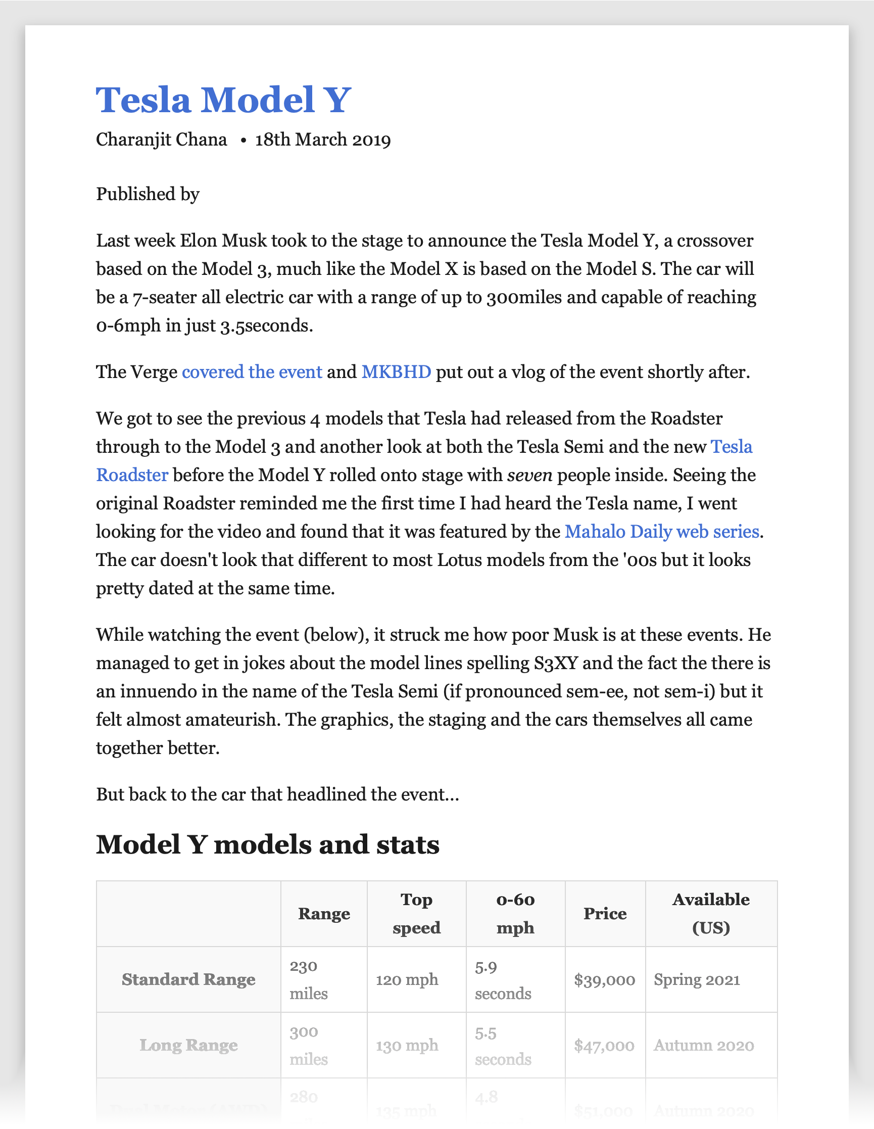
This is week 74, and I haven't yet narrowed myself to a regular set of topics yet. I have a wide range of interests, from EVs to football or photography to Netflix.
I could easily comment on Apple for weeks on end, but for now I'll put the majority of that effort into post-keynote articles. Technology in general is certainly I want to write more about but I'm not entirely sure what my angle is yet. I have plenty of thoughts on the smart home market for example and I'd love to look into it more. Automation would be another area.
There have even been a couple of ocassions where I've posted a holding page on Monday so that I can update later that week with whatever was announced. I can handle doing this a couple of times each year but not sure it works in my favour because RSS feeds and social media posts are timed but I made some changes to how articles are published to make the schedule more flexible. I'll continue to experiment during 2019 with how these events are scheduled. It would really be better for me if Apple moved the events to a weekend.
Notable
I hadn't planned to share notable items as I thought providing content for 1 Thing A Week would have been a big enough challenge, but as I discovered there were items that didn't warrant a full week's attention. It was an inevitable feature and it offers a non-committal channel for me to share more with my audience.
Even notable items evolved over time with some now having commentary. The original idea was to push people to the content but I recently changed the way they're handled by embedding the content on a dedicated page instead. This not only keeps you within my walls but makes discovery of other content easier. It's a good challenge deciding if my commentary is even worthwhile as it's very easy to write something and yet say nothing. The format is often much shorter and I'm still finding the right voice for it all.
Your thoughts?
This re-design ended up being months in the works and this article is one of the more personal I've put together. I've read a lot about design over the past 6 months and tried to put as much as possible into practice. The website is still responsive but hopefully easier on the eye and easier to read and it's what I've always wanted it to be.
Your feedback is always appreciated.
Tags: 1 Thing A Week, design, development