![]() Week 161 was posted by Charanjit Chana on 2020-11-23.
Week 161 was posted by Charanjit Chana on 2020-11-23.
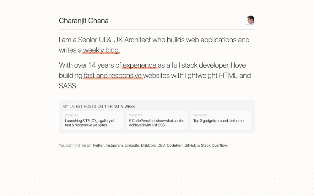
Earlier this year I decided it was time to look for a new role and with that came the task of bringing my CV and my portfolio website up to date. I use charanj.it as my portfolio's domain which I've had for about a decade but I’ve had something live for 15 years or more.
I’d already spent some time simplifying my portfolio quite a bit earlier in the year and while I think it was a good change, it wasn’t quite the change I was looking for.
I wanted something minimal with just enough information, nothing more. My first attempt was perfect for this criteria but not for much else. Every time I added another component to the page it felt shoehorned in. I put it forward for a review and it got fairly good feedback, although there were a few points that needed sorting out to address a drop in the page speed score.
Eventually I manage to achieve a 100 page speed score for both desktop and mobile, so that was a must this time around too. I have total control over my portfolio so it was fairly simple to achieve this time around.
My portfolio relies on system fonts to bring the loading time down. The layout is identical but the fonts will vary depending on the operating system you're using. While I've done this for 1 Thing A Week too for a long time, my portfolio needed a little more attention. Running macOS Mojave on my personal laptop meant I didn't have access to all of the different weights offered by Apple's San Francisco font. In Sketch I could make it pixel perfect but that was never the case in the browser. On Catalina in looked great but simplifying it to rely on fewer weights made it all a little more manageable. Google Fonts can impact the page speed score and so can Google Analytics so I dropped both early on. I’ve developed a rudimentary page counting system which is all I really need. I don’t care who you are I just want to know you were here (or there).
I'm injecting CSS directly into the page instead of loading another file and the same with JavaScript. This means a vey small page is fetched in one go rather than a few little files. There’s caching all over the place too which all helps to make it as fast as possible.
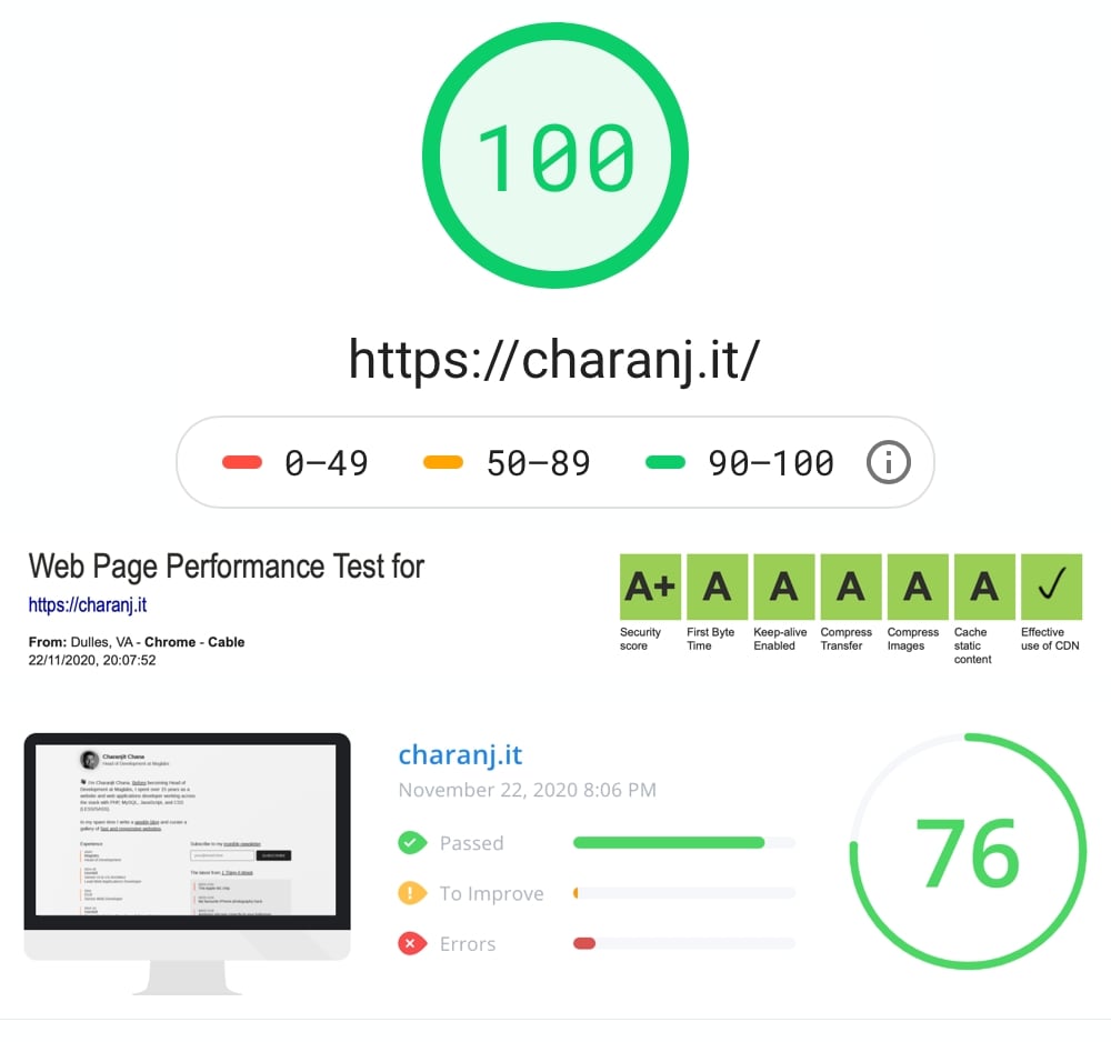
The last of these is frustrating, some of the criteria I can do nothing about and the others make no material difference. But it's green which is what matters most.
Dark mode
I’ll revisit my approach to dark mode next week, but it's worth mentioning that this was a lightbulb moment for me when it comes to CSS variables. I'd noticed trend when reviewing sites for SITEJOY but it didn't click until I was trying to solve this particular issue. My CSS is much simpler now and the page looks right in both modes rather than feeling like I might have compromised (which is how it turned out earlier in the year). I've uploaded full-screen screen captures from my phone as PDFs for both light and dark modes, so feel free to take a look and compare.
I also spent quite a while optimising the layout and markup so that it was handled better when printing and also for Safari’s reader mode. I must have even through 5 revisions but it was worth it because your version of Safari would cause completely different elements to be rendered. It should be consistent for everyone now.
For anyone wondering, the key was the amount of text when there were multiple sections. The longest section would get treated as the content which was problematic in itself, but there were scenarios where the H2 would be picked as the title instead of the H1.
I’ve kept the colours fairly neutral and introduced a tiny bit of orange for personal items and red for where I promote 1 Thing A Week. It’s enough to lift the page I think without it being overbearing.
Promoting other content
For the first time there’s a genuine attempt to promote my blog articles from here on 1 Thing A Week on my portfolio and I’ve added a subscription box directly to my newsletter. What began as a simple act of blogging has become an expanded online presence. For web development posts in cross posting to DEV and in general I’m a little more comfortable putting thought pieces out there, with my piece in Brexit for example.
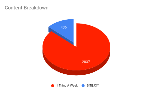
For years I kept my portfolio as a single page, one that told you all you needed to know. It's a format that has served me well but it's grown to include a second page now. My online presence has expanded a lot since 2017. I've seen it grow from a single page to over 3000 pages spread between here on 1 Thing A Week with weekly posts and notable items, my three portfolio pages and well over 400 examples of fast and responsive sites hared on SITEJOY.
In all l honestly that wasn’t the intention when I set out creating this blog but it was a nice side effect of actually putting a predictable system for myself in place.
How's the job hunt going?
I had a long notice period, but In October I started a new role as the Head of Development for MagLabs. It felt like a crazy thing to be doing during a pandemic but it was the change I needed and I’m really enjoying my new role.
I shared some thoughts on the topic of moving on over on DEV last week, my experience in 2020 gives me some evidence that I took the right approach with my previous role and made myself replaceable.
Tags: development, portfolio, seo, development, portfolio, seo