![]() Week 223 was posted by Charanjit Chana on 2022-01-31.
Week 223 was posted by Charanjit Chana on 2022-01-31.
Over the past couple of months I've seen the 'skip to content' or 'skip navigation' links coming up as a must have for accessibility. I've rarely implemented these, which is bad on my part when the page structure clearly follows a Header (and Nav) > Content > Footer pattern.
It was a video by Kevin Powell on implementing skip links that gave me the nudge to put my thoughts into practice. I don't know if I'm on to something or just overthinking the situation.
More and more I've just been wondering how suitable they are for the modern web. We no longer have to structure the contents on the page in the same order as it's displayed. This was always possible with absolute positioning, but terrible on sites with dynamic content and would make responsive design unnecessarily tough.
Thanks to CSS I can now make the header look like it comes first, while it actually existed towards the bottom of the actual DOM. This would be very confusing for someone working in the browser's dev tools. For someone tabbing through an interface it might also be a little odd that you jump to the top after the content but I think the structure of the document would be more honest this way. Especially someone using a screen reader. Basically, I'm advocating to get rid of 'skip navigation' or 'skip to content' links on the web.
Now, having said all of that, what about the homepage of a site? Taking bbc.co.uk as an example, to me it would make sense to structure the document so that the homepage itself did have the header and navigation first in the DOM... it's on individual article pages (the bulk of the site's pages) where the DOM should be reordered. So on some pages the navigation before the content and skip links could be quite useful but in more situations they're a hinderance.
If you head to the BBC's homepage and hit the tab key twice, you'll see the option 'Skip to content' appear and hitting enter takes you about 100 pixels down the page. Now you can tab through more useful content.
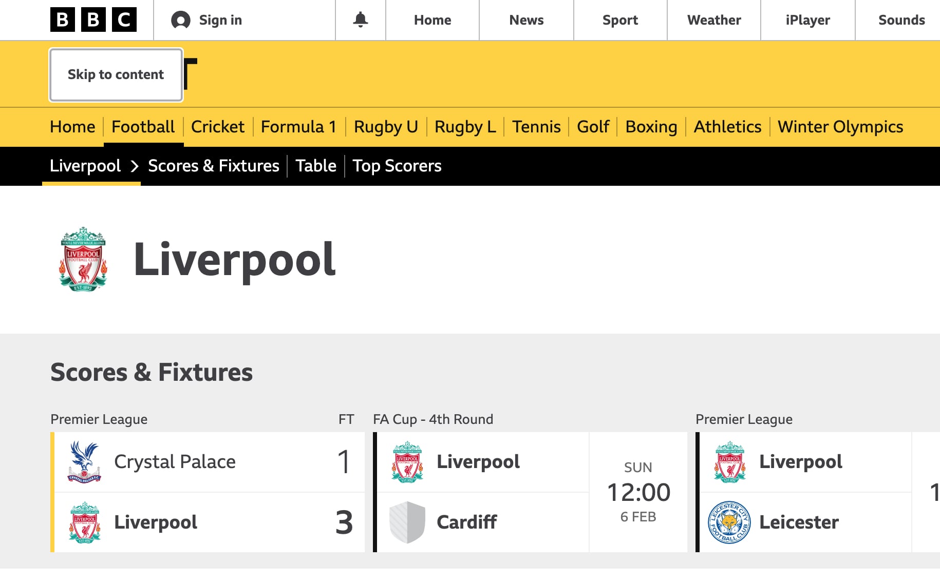
Oddly, to me at least, the heading for the page 'Welcome to the BBC' is skipped when you use this option... but that isn't the main heading at all! There's a hidden heading that says 'BBC Homepage' that has a class with the suffix 'VisuallyHidden'. This is odd from an accessibility and a SEO perspective, at least how I understand both. Odd that a screen reader would be asked to read content a 'regular' user can't see...
Possible alternative to skip links
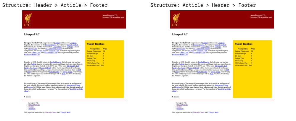
So how would I solve this problem? As I mentioned, I would look at restructuring the DOM. In fact, I've put together two examples of the same page. Both look the same in the browser, but the HTML is structured differently on both.
You can see these two pages by following the links below and I would encourage you to look at the HTML structure, inspect the pages and tab through the links until you see the 'skip' links on the page.
If you head to the first page and use a screen reader or voice over tool, you get a sense of what the experience is like for someone across the web. Contrast that with the restructured page and you're taken straight to the content, no need to skip or sit through the site name and navigation menus. This is the basic structure of the second page which makes more sense for the hierarchy in my opinion.
<article>
    <!-- article content -->
    <aside></aside>
</article>
<header>
    <nav></nav>
</header>
<footer></footer>
Both CSS grid and flexbox give us the ability to reorder how elements fit on the page and this feels like an excellent example for when we should be taking advantage of these capabilities.
If I was to implement this for real, I would certainly look at the homepage to be an exception to the rule and have the HTML code for the header at the top of the document. Almost as an introduction to the site, which would give an option to present the site's name and top level links to the visitor. In this case, skip links would make perfect sense. Maybe for listings or category pages this would make sense too, but for the majority of the pages I don't see how presenting the site to a visitor makes much sense at all.
My caveat...
While I've always tried to write semantic HTML that makes sense and have worked to meet WCAG AAA (if not AA) throughout my career, I am not an accessibility expert or a screen reader user so I would defer I'd have to defer to actual experts and users to know if any of this really made any sense.
Skip links have always bothered me, but as someone who rarely encounters them I accept that I may be on the wrong side of how useful they actually are and I'd be happy to discuss with anyone that has any thoughts on the topic.
Tags: accessibility, css, development, html, web